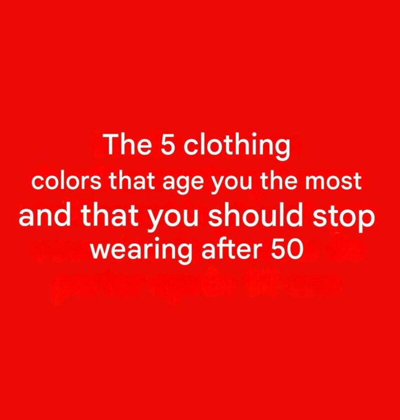
5 Colors That May Not Be the Most Flattering After 50 (and What to Try Instead)
There is no age rule that says you must avoid certain colors—personal style, skin tone, hair color, and confidence matter far more than a number. However, some shades can sometimes make the complexion appear more tired or washed out, especially if they are close to your skin tone or lack contrast.
Here are five colors that some people find less flattering and alternatives that often add more brightness:
1. Dull beige or grayish neutrals
- Very pale, muted shades can sometimes blend into the skin and reduce contrast.
- Try: warm camel, cream, ivory, taupe, or rich chocolate brown.
2. Neon colors
- Extremely bright shades can overpower the face and draw attention away from your features.
- Try: jewel tones like emerald, sapphire, ruby, or deep teal.
3. Yellow-green or overly acidic shades
- Some yellow-based greens can emphasize uneven skin tones.
- Try: olive, forest green, or emerald.
4. Very washed-out pastels
- Pale pinks, blues, or lavenders may look less vibrant on some people.
- Try: deeper versions such as rose, periwinkle, plum, or berry.
5. Flat black worn close to the face
- Black is classic and works beautifully for many people, but in some cases it can create harsh contrast or emphasize shadows.
- Try: navy, charcoal, espresso, or soften black with a colorful scarf or jewelry.
Tips for choosing colors that brighten your look:
- Hold a color near your face in natural light and notice whether it makes your skin look more alive.
- Choose shades that complement your undertone (warm, cool, or neutral).
- Add color near the face with scarves, tops, jewelry, or makeup if you love darker clothing.
The most flattering color is usually the one that makes you feel confident and suits your individual coloring—not simply one tied to age.